Visualising time series data#
import pandas as pd
import numpy as np
import matplotlib.pyplot as plt
Step 1: Import emergency department reattendance data.
This is a time series from a hospital that measures the number of patients per month that have reattended an ED within 7 days of a previous attendance.
This can be found in “data/ed_reattend.csv”
Hint 1: look back at the lecture notes and see how
pd.read_csv()was used.Hint 2: The format of the ‘date’ column is in UK standard dd/mm/yyyy. You will need to set the
dayfirst=Trueofpd.read_csv()to make sure pandas interprets the dates correctly.Hint 3: The data is monthly and the dates are all the first day of the month. This is called monthly start and its shorthand is ‘MS’
url = 'https://raw.githubusercontent.com/hsma-master/hsma/master/12_forecasting/data/ed_reattend.csv'
reattends = pd.read_csv(url, index_col='date',
                        parse_dates=True, dayfirst=True)
reattends.index.freq = 'MS'
Step 2: Check the shape of the DataFrame and print out the first 5 observations
reattends.shape
(43, 1)
reattends.head()
| reattends | |
|---|---|
| date | |
| 2014-04-01 | 1094 |
| 2014-05-01 | 1266 |
| 2014-06-01 | 1170 |
| 2014-07-01 | 1239 |
| 2014-08-01 | 1197 |
Step 3: Check the minimum and maximum date of the series
reattends.index.min()
Timestamp('2014-04-01 00:00:00', freq='MS')
reattends.index.max()
Timestamp('2017-10-01 00:00:00', freq='MS')
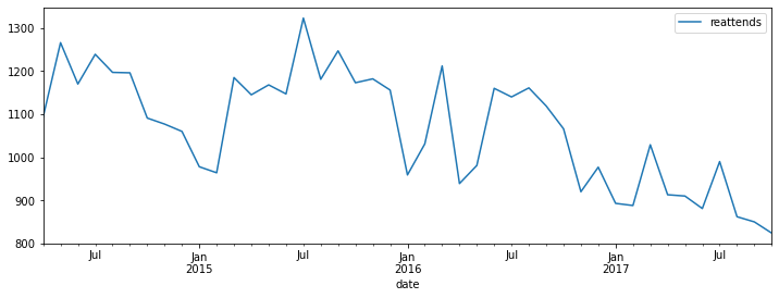
Step 4: Create a basic plot of the time series
reattends.plot(figsize=(12,4))
<AxesSubplot:xlabel='date'>
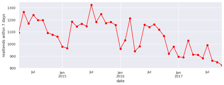
Step 5: Improve the appearance of your chart
Try the following:
Add a y-axis label
Add gridlines to the plot
Add markers to block
Change the colour of the line
Experiment with using seaborn
sns.set()
ax = reattends.plot(figsize=(12,4), color='red', marker='o', legend=False)
ax.set_ylabel('reattends within 7 days')
Text(0, 0.5, 'reattends within 7 days')
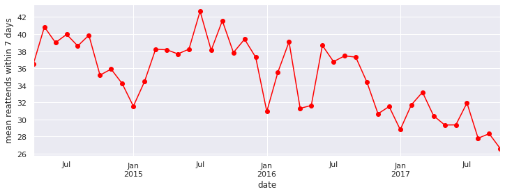
Step 6: Perform a calender adjustment
The data is at the monthly level. Therefore some of the noise in the time series is due to the differing number of days per month. Perform a calender adjust and plot the daily rate of reattendance.
reattend_rate = reattends['reattends'] / reattends.index.days_in_month
ax = reattend_rate.plot(figsize=(12,4), color='red', marker='o', legend=False)
ax.set_ylabel('mean reattends within 7 days')
Text(0, 0.5, 'mean reattends within 7 days')
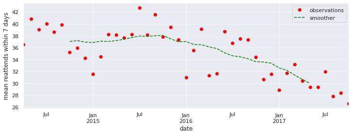
Step 7: Run a smoother through the series to assess trend
Hint: Try using the .rolling method of dataframe with a window=12 and center=True to create a 12 month centred moving average
Is there any benefit from switchoing to a 6 month MA? Why does the 6-MA look different to the 12-MA.
Use the calender adjusted data.
WINDOW = 12
smoother = reattend_rate.rolling(window=WINDOW, center=True).mean()

ax = reattend_rate.plot(figsize=(12,4), color='red', marker='o', linestyle='')
smoother.plot(ax=ax, color='green', linestyle='--')
ax.set_ylabel('mean reattends within 7 days')
ax.legend(['observations', 'smoother'])
<matplotlib.legend.Legend at 0x7fb53c10d430>
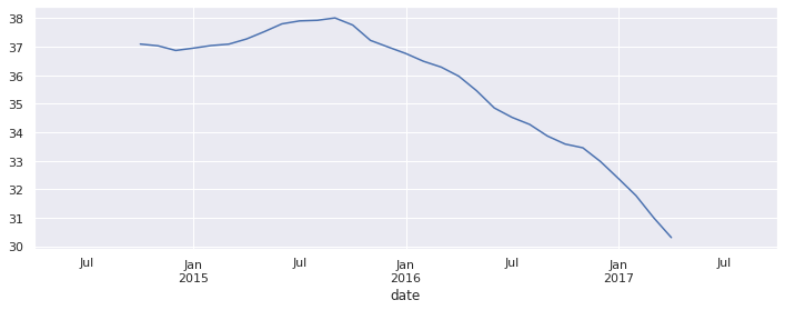
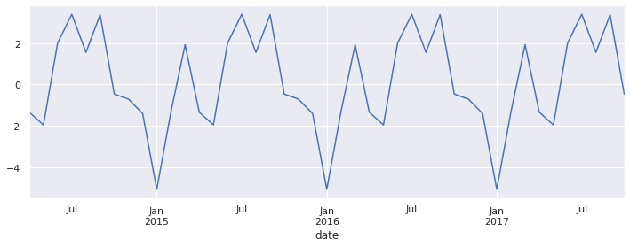
Step 8: Perform a seasonal decomposition on the time series
Plot the trend, seasonal and remainder components of the decomposition.
Try both an additive and multiplicative model. What is the difference between the two models?
Hint: Look back at the lecture for a function to help you.
from statsmodels.tsa.seasonal import seasonal_decompose
decomp = seasonal_decompose(reattend_rate, period=12, model='add')
decomp.trend.plot(figsize=(12,4))
<AxesSubplot:xlabel='date'>
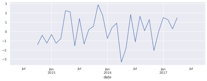
decomp.seasonal.plot(figsize=(12,4))
<AxesSubplot:xlabel='date'>
decomp.resid.plot(figsize=(12,4))
<AxesSubplot:xlabel='date'>