Introduction to Matplotlib#
It is sometime hard to know where to start with when teaching matplotlib. This is because the library is very large and while easy to use it has a lot of fine tune control of plotting involved. In this first look at matplotlib I am going to introduce:
The matplotlib object orientated API
The components of a plot including figure and axis objects
How to plot a single variable on a chart
How to plot multiple variables on a chart and how to skillfully control the legend.
How to output a high resolution image file.
The online messy world of matplotlib#
It is worth understanding that there multiple ways to use matplotlib. This flexibility, in my opinion, has led to a problematic and confusing mix of documentation and examples online. For our learning purposes, I am going to focus on using the object orientated interface to matplotlib. The abstraction offered via the OOP interface is the most pythonic, cleanest and easiest to follow (again in my opinion). Once you have a good grasp of the approaches here I suspect you won’t look back, but you will also be able to understand the, sometimes messy, examples you find in blogs and documentation online.
Importing#
We’ll need both numpy and pandas for our examples here. We also need to import matplotlib. The standard way to import matplotlib is
import matplotlib.pyplot as plt
import pandas as pd
import numpy as np
Example dataset for plotting#
We will again use the Covid-19 database from the Netherlands. As a reminder this contains a time series of deaths, hospital admissions and reported cases. We will reuse the cleaning code we developed in an earlier section.
De Bruin, J, Voorvaart, R, Menger, V, Kocken, I, & Phil, T. (2020). Novel Coronavirus (COVID-19) Cases in The Netherlands (Version v2020.11.17) [Data set]. Zenodo. http://doi.org/10.5281/zenodo.4278891
DATA_URL = 'https://raw.githubusercontent.com/health-data-science-OR/' \
            + 'hpdm139-datasets/main/RIVM_NL_provincial.csv'
def clean_covid_dataset(csv_path):
    '''
    Helper function to clean the netherlands covid dataset

    Params:
    -------
    csv_path: str
        Path to Dutch Covid CSV file

    Returns:
    -------
    pd.Dataframe
        Cleaned covid dataset in wide format
    '''

    translated_names = {'Datum':'date',
                        'Provincienaam':'province',
                        'Provinciecode':'province_code',
                        'Type':'metric',
                        'Aantal':'n',
                        'AantalCumulatief':'n_cum'}

    translated_metrics = {'metric': {'Overleden':'deaths',
                                     'Totaal':'total_cases',
                                     'Ziekenhuisopname':'hosp_admit'}}

    # method chaining solution.  Can be more readable
    df = (pd.read_csv(csv_path)
            .rename(columns=translated_names)
            .replace(translated_metrics)
            .fillna(value={'n': 0, 'n_cum': 0, 'province': 'overall'})
            .astype({'n': np.int32, 'n_cum': np.int32})
            .assign(date=lambda x: pd.to_datetime(x['date']),
                    metric=lambda x: pd.Categorical(x['metric']))
            .drop(['province_code'], axis=1)
            .pivot_table(columns=['metric'],
                         index=['province','date'])
    )

    return df
neth_covid = clean_covid_dataset(DATA_URL)
A simple plotting example#
Let’s create a plot of positive cases reported in the Netherlands. The first thing we need to do is create a Figure object. The constructor takes a number of parameters, but for our purposes the most useful on is figsize which sizes the plots using a 2d tuple.
# create an instance of matplotlib.figure.Figure
fig = plt.figure(figsize=(12,3))
Now we have a figure we can create an AxesSubplot object. This has lots of useful methods attached to it that all us to visualise datasets and customise the plot. We create an axes object by calling a method from the Figure object.
# create an AxesSubplot
ax = fig.add_subplot()
You now have a figure fig and an axis subplot ax. Try to get into the habbit of creating your plots this way. These objects will come in very handy! Put these two lines of code together and you get a blank plot.
fig = plt.figure(figsize=(12,3))
ax = fig.add_subplot()
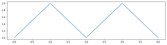
Let’s assume we have the following dataset:
dataset = [1, 2, 1, 2, 1]
To plot this data we can intuitively call the plot method of ax like so:
fig = plt.figure(figsize=(12,3))
ax = fig.add_subplot()
dataset = [1, 2, 1, 2, 1]

# plot in this case returns a 2D line plot object
line_plot = ax.plot(dataset)
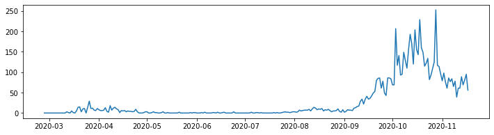
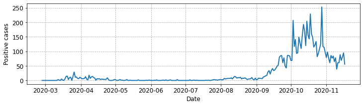
The good news is that there is no real difference between plotting our simple data and a proper health data set. For example to plot positive cases in Groningen:
fig = plt.figure(figsize=(12,3))
ax = fig.add_subplot()

# using indexing to select gronigen and the daily number of cases
line_plot = ax.plot(neth_covid.loc['Groningen']['n']['total_cases'])
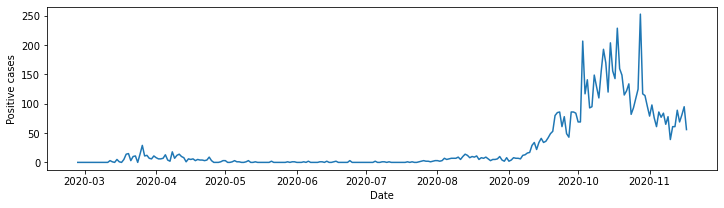
It is bad practice to exclude axis labels. In true pythonic style setting the x and y labels is a simple operation. We simply add the following code to our listing:
# set x axis label
ax.set_xlabel("Date")

# set y axis label
ax.set_ylabel("Positive cases")
fig = plt.figure(figsize=(12,3))
ax = fig.add_subplot()
ax.set_xlabel("Date")
ax.set_ylabel("Positive cases")
line_plot = ax.plot(neth_covid.loc['Groningen']['n']['total_cases'])
Helping the reader#
Let’s make a few final tweaks to our plot to help readability.
Increase the font size of axis labels and ticks to 12
Add in x, y grid lines
Increase the line width of the plot
Increasing the font size of the x and y axis labels requires us to add a fontsize parameter when they are set. For example,
ax.set_xlabel("Date", fontsize=12)
The command is a little less obvious for the tick labels themselves (tick labels are the values on the axis). We need to use a seperate method called tick_params. To set both tick label sizes to 12 we use:
ax.tick_params(axis='both', labelsize=12)
There might be instances where you only need to set the tick label size on one axis. For example, to set only for the x or y axis use:
ax.tick_params(axis='x', labelsize=12)
ax.tick_params(axis='y', labelsize=12)
As this is quite a long plot its useful to add grid lines to the help a reader. We can do this by calling the axis grid method
ax.grid()
By default that will provide solid black grid lines. We can vary the style by passing parameters to the command. For example, to change the line style to ‘–’ we can
ax.grid(linestyle='--')
We will also increase the line width using the lw parameter of the .plot() method. You might need to experiment with different widths in practice. Here’s an example:
line_plot = ax.plot(neth_covid.loc['Groningen']['n']['total_cases'], lw=2.0)
The full modified code listing is below.
fig = plt.figure(figsize=(12,3))
ax = fig.add_subplot()

# add in fontsize parameter
ax.set_xlabel("Date", fontsize=12)
ax.set_ylabel("Positive cases", fontsize=12)

# include x, y grid
ax.grid(linestyle='--')

# set size of x, y ticks
ax.tick_params(axis='both', labelsize=12)

# add `lw=2.0` to increase line width (default = ~1.5)
line_plot = ax.plot(neth_covid.loc['Groningen']['n']['total_cases'], lw=2.0)
Plotting multiple variables and using legends.#
Let’s modify our plot above so we can explore multiple provinces at the same time. I’ve chosen a stacked line. We will put the plotting code in a function called plot_stacked_cases. We can pass the subgroups we wish to explore, their labels (that we will include in a legend) and the y axis label.
We include a stacked plot by calling the method
ax.stackplot()
We will first plot ‘Groningen’, ‘Utrecht’, ‘Gelderland’, and ‘Drenthe’. To understand the plot we will need to include a legend. Matplotlib can help with positioning the legend, but we can also fine tune its position, fontsize and number of columns.
The basic command to include a legend is:
ax.legend()

# equivalent to ...
ax.legend(loc='best')
By default matplotlib chooses the so called best position for the legends location. Let’s test that out to see how it looks.
def plot_stacked_cases(sub_groups, labels, y_label, leg_loc='best', n_cols=1):
    fig = plt.figure(figsize=(12,3))
    ax = fig.add_subplot()

    ax.set_xlabel("Date", fontsize=12)
    ax.set_ylabel(y_label, fontsize=12)

    # include x, y grid
    ax.grid(ls='--')

    # set size of x, y ticks
    ax.tick_params(axis='both', labelsize=12)

    # create stacked plot
    stk_plt = ax.stackplot(sub_groups[0].index, sub_groups, labels=labels)

    # add legend - matplotlib decides placement
    ax.legend(loc=leg_loc, ncol=n_cols)

    return fig, ax
# select the analysis sub group and store in list. (exclude overall)
provinces = ['Groningen', 'Utrecht', 'Gelderland', 'Drenthe']
subgroups = [neth_covid.loc[p]['n']['total_cases'] for p in provinces]

fig, ax = plot_stacked_cases(subgroups, provinces, "Positive cases")
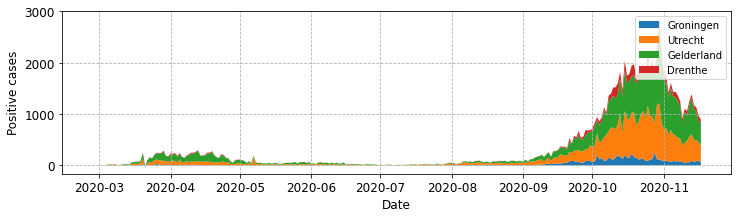
For simple plots you should hopefully find ‘best’ works well, but in our case, with four series, its end ups not being ideally positioned. The first thing we can tweak is its position using the loc parameter
# include after a call to .plot()
ax.legend(loc='upper left')
There are multiple values you might try (default is best or0).
Location String |
Location Code |
|---|---|
‘best’ |
0 |
‘upper right’ |
1 |
‘upper left’ |
2 |
‘lower left’ |
3 |
‘lower right’ |
4 |
‘right’ |
5 |
‘center left’ |
6 |
‘center right’ |
7 |
‘lower center’ |
8 |
‘upper center’ |
9 |
‘center’ |
10 |
It is usual to try out a few of these options when deciding on how to present a figure.
# select the analysis sub group and store in list. (exclude overall)
provinces = ['Groningen', 'Utrecht', 'Gelderland', 'Drenthe']
subgroups = [neth_covid.loc[p]['n']['total_cases'] for p in provinces]

fig, ax = plot_stacked_cases(subgroups, provinces, "Positive cases",
                             leg_loc='upper left')
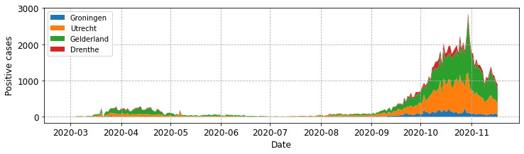
By default the legend is presented as a single column. We can increase the number of columns by setting the ncol parameter. For example to set this to 4 and locate the legend upper centre:
ax.legend(loc='upper left', ncol=4)
# select the analysis sub group and store in list. (exclude overall)
provinces = ['Groningen', 'Utrecht', 'Gelderland', 'Drenthe']
subgroups = [neth_covid.loc[p]['n']['total_cases'] for p in provinces]

fig, ax = plot_stacked_cases(subgroups, provinces, "Positive cases",
                             leg_loc='upper left', n_cols=4)
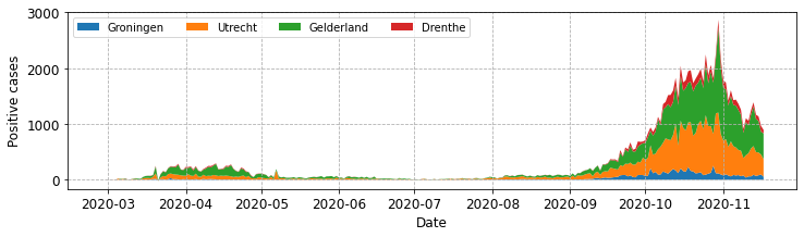
Note that we have called the legend method of the ax object. I’ve found this to be the simplest approachin practice, but sometimes I need to position the legend outside of the central plotting area. To do this you can call the the method from the fig object.
fig.legend(loc='upper center', ncol=4)
Using the code above you should find that the the legend appears above the plotting area in the figure. This might sense if you needed to include a higher number of subgroups, for example all of the provinces in a single plot.
Let’s first look at what the plot looks like with our original implementation.
# drop the index and get the unique provinces.
provinces = neth_covid.reset_index()['province'].unique().tolist()

# get all subgroups and exclude overall.
subgroups = [neth_covid.loc[p]['n']['total_cases'] for p in provinces
             if p != 'overall']

fig, ax = plot_stacked_cases(subgroups, provinces, "Positive cases",
                             leg_loc='upper left', n_cols=4)
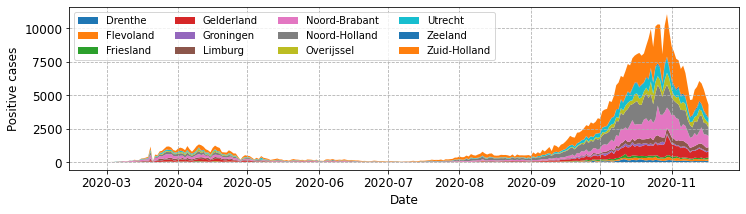
That works okay, but its not ideal that the central plotting area contains a very large legend. Now let’s modify plot_stacked_cases to call fig.legend().
def plot_stacked_cases(sub_groups, labels, y_label, leg_loc='best', n_cols=1):
    fig = plt.figure(figsize=(12,3))
    ax = fig.add_subplot()

    ax.set_xlabel("Date", fontsize=12)
    ax.set_ylabel(y_label, fontsize=12)

    # include x, y grid
    ax.grid(ls='--')

    # set size of x, y ticks
    ax.tick_params(axis='both', labelsize=12)

    # create stacked plot
    stk_plt = ax.stackplot(sub_groups[0].index, sub_groups, labels=labels)

    # add legend - matplotlib decides placement
    fig.legend(loc=leg_loc, ncol=n_cols)

    return fig, ax
# drop the index and get the unique provinces.
provinces = neth_covid.reset_index()['province'].unique().tolist()

# get all subgroups and exclude overall.
subgroups = [neth_covid.loc[p]['n']['total_cases'] for p in provinces
             if p != 'overall']

fig, ax = plot_stacked_cases(subgroups, provinces, "Positive cases",
                             leg_loc='upper left', n_cols=5)
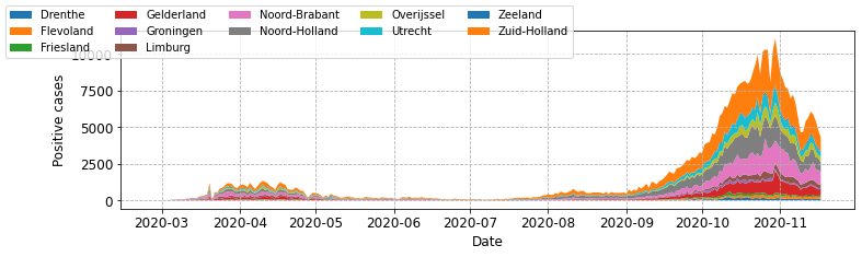
Using the code above, try a few different location parameters. In most cases the legend ends up overlapping part of an axis or the plot line. That is quite frustrating! A further level of fine tuning is needed. To do this we can employ the bbox_to_anchor parameter. This takes a tuple of the form (x, y) or (x, y, width, height). To begin with I’d recommend just using the (x, y) approach; when calling from fig x and y are figure coordinate positions. The value (0.5, 0.5) places the corner specified by loc of in the centre of the plot. For example,
    # add legend.  Upper left corner at centre of figure.
    fig.legend(loc='upper left', bbox_to_anchor=(0.5, 0.5)

    # add legend.  lower centre corner at centre of figure.
    fig.legend(loc='lower centre', bbox_to_anchor=(0.5, 0.5)

    # add legend.  lower centre corner at left centre of figure.
    fig.legend(loc='lower centre', bbox_to_anchor=(0.0, 0.5)
In general, I think you will need to do a bit of trial and error to get the positioning just as you want it. This should also help you understand how the
bbox_to_anchorandlocparameters work together. Its worth knowing that (1.0, 1.0) is the top right of the figure, and (0.0, 0.0) is bottom left. You can of course go above and below these values.
Here’s a final version of plot_stacked_cases that let’s you control bbox_to_anchor and some code that places a legend outside the main plotting area. Try a few parameter combinations to build an understanding of how it works.
def plot_stacked_cases(sub_groups, labels, y_label, leg_loc='best', n_cols=1,
                       bbox_to_anchor=(0.5, 0.5)):

    fig = plt.figure(figsize=(12,3))
    ax = fig.add_subplot()

    ax.set_xlabel("Date", fontsize=12)
    ax.set_ylabel(y_label, fontsize=12)

    # include x, y grid
    ax.grid(ls='--')

    # set size of x, y ticks
    ax.tick_params(axis='both', labelsize=12)

    # create stacked plot
    stk_plt = ax.stackplot(sub_groups[0].index, sub_groups, labels=labels)

    # add legend
    fig.legend(loc=leg_loc, ncol=n_cols, bbox_to_anchor=bbox_to_anchor)

    return fig, ax
fig, ax = plot_stacked_cases(subgroups, provinces, "Positive cases",
                             leg_loc='lower center', bbox_to_anchor=(0.5, -0.3),
                             n_cols=4)
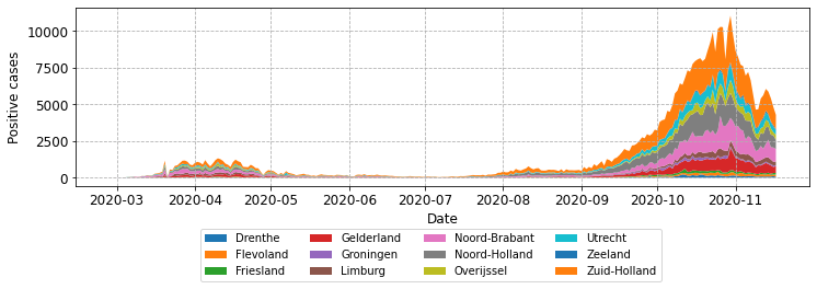
Saving a high quality image#
If you are working outside of a Jupyter notebook, for example, for a publication or report, then you will need to save your chart as a high resolution image. This is achieved with the .savefig() method of the fig object. I recommend that you make use of the dpi or dots per inch parameter (e.g. set to 300 for a academic publication) and set bbox_inches='tight' which removes the padding around the image.
fig, ax = plot_stacked_cases(subgroups, provinces, "Positive cases",
                             leg_loc='lower center', bbox_to_anchor=(0.5, -0.3),
                             n_cols=4)

fig.savefig('stacked.png', dpi=300, bbox_inches='tight')
You have learnt useful things here!#
You may not realise it from our simple example, but you have learnt a lot about matplotlib. You now have some code that can be reused to create and manipulate a large number of plots. Yes, there are many types of different plots you can create and they are not covered here. For help with those I recommend you check out the matplotlib official documentation and its example gallary