Case study: heat map#
import pandas as pd
import numpy as np
import matplotlib.pyplot as plt
DATA_URL = 'https://raw.githubusercontent.com/health-data-science-OR/' \
            + 'hpdm139-datasets/main/wisconsin.zip'
def load_wisconsin(path):
    '''
    Load and clean the wisconsin breast cancer
    dataset.
    '''
    recoded_label = {'diagnosis': {'M':'1',
                                   'B':'0'}}

    to_drop = ['Unnamed: 0', 'id']
    df = (pd.read_csv(path)
            .drop(to_drop, axis=1)
            .replace(recoded_label)
            .astype({'diagnosis': np.byte})
         )
    return df[df.columns[1:]], df['diagnosis']
X, y = load_wisconsin(DATA_URL)
X.head().head(2)
| radius_mean | texture_mean | perimeter_mean | area_mean | smoothness_mean | compactness_mean | concavity_mean | concave points_mean | symmetry_mean | fractal_dimension_mean | ... | radius_worst | texture_worst | perimeter_worst | area_worst | smoothness_worst | compactness_worst | concavity_worst | concave points_worst | symmetry_worst | fractal_dimension_worst | |
|---|---|---|---|---|---|---|---|---|---|---|---|---|---|---|---|---|---|---|---|---|---|
| 0 | 17.99 | 10.38 | 122.8 | 1001.0 | 0.11840 | 0.27760 | 0.3001 | 0.14710 | 0.2419 | 0.07871 | ... | 25.38 | 17.33 | 184.6 | 2019.0 | 0.1622 | 0.6656 | 0.7119 | 0.2654 | 0.4601 | 0.11890 |
| 1 | 20.57 | 17.77 | 132.9 | 1326.0 | 0.08474 | 0.07864 | 0.0869 | 0.07017 | 0.1812 | 0.05667 | ... | 24.99 | 23.41 | 158.8 | 1956.0 | 0.1238 | 0.1866 | 0.2416 | 0.1860 | 0.2750 | 0.08902 |
2 rows × 30 columns
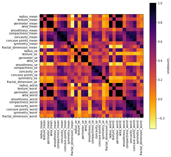
Visualising Correlations with a heatmap#
def correlation_heat_map(correlation_matrix, cmap='inferno_r', figsize=(8,8)):
    '''
    Correlation heat map

    Params:
    -------
    correlation_matrix: pd.DataFrame,
        n x n matrix with feature names

    cmap: str, optional (default='inferno_r')
        The colour mapping for the heatmap

    figsize: tuple (int, int)
        Size of figure.

    Returns:
    -------
    tuple (figure, image)
    '''
    fig = plt.figure(figsize=figsize)
    ax = fig.add_subplot()
    im = ax.imshow(correlation_matrix, cmap=cmap)

    # Make sure there are enough visible tick marks
    ax.set_xticks(ticks=np.arange(len(correlation_matrix.columns)))
    ax.set_yticks(ticks=np.arange(len(correlation_matrix.columns)))

    # add the feature names and rotate x axis 90 degrees.
    ax.set_xticklabels(list(correlation_matrix.columns), rotation=90)
    ax.set_yticklabels(list(correlation_matrix.index))

    # add colour coding legend
    cbar = fig.colorbar(im, ax=ax)
    cbar.ax.set_ylabel('Correlation', rotation=-90, va="bottom");

    return fig, im
correlation_matrix = X.corr()
fig, im = correlation_heat_map(correlation_matrix = correlation_matrix)